This page presents a number of lectures, articles, and other thoughts on art, design, and Japanese society. At the bottom of this page is a list of notes to the images on the previous pages.
If you have any comments or questions
about anything on this site, please contact
me at the following
e-mail address:
jcali@gol.com
Shinto Shrines of Japan:
The Blog Guide
The Ancient Art of Maki-e
The Art and Craft of Netsuke
"Masterpiece in a Pot"
The Cultivation of Bonsai
The Quiet Beauty of the Japanese Garden
Art, Design, Craft, and Creativity
Notes to the Illustration Page Images
Notes to the Design Page Images
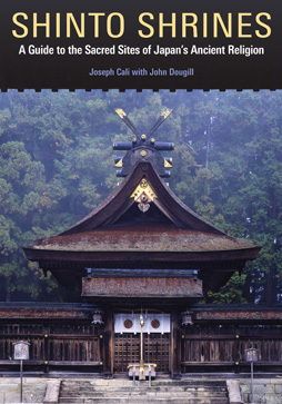
This is an image of my upcoming book "Shinto Shrineßs, A Guide to the Sacred Sites of Japan's Ancient Religion", written with coauthor John Dougill.
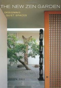
This handsome book provides an overview of Japanese garden history and theory and relates it to the modern stone and sand garden. Small to large home garden layouts are included, as are several specific garden constructions with tips from leading Japanese garden designers.
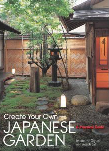
Co-written with Garden designer Motomi Oguchi, this hands-on book gives step-by-step instruction on everything from samll tsuboniwa to walkways and interior gardens. The author has taken traditional Japanee gardens and arranged them to fit the needs of Western garden enthusiasts.
Shinto Shrines of Japan: The Blog Guide
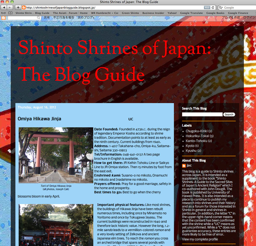
In conjunction with the book "Shinto Shrines; A Guide to the Sacred Sites of Japan's Ancient Religion" I have launched the "Blog Guide" pictured above. The Blog Guide features the same format as the book and includes shrines which were not included in the book. This gives me an opportunity to continue my research into Shinto Shrines and the ability to highlight shrines which, in a perfect world, would all have made it into the book. One other major difference is that while I have visited and confirmed with shrine officials the content of the shrines listed in the book, I have not yet done so with all those listed in the blog. I do intend to confirm all the information as time goes by. In addition, I will be adding other research related to Shinto in general and shrines in particular, as well as book reviews and links to usefull and generally reliable information on the web. Please have a look and post a comment.
Shinto Shrines of Japan: The Blog Guide
(Originally printed in "Fujinon Scope" )
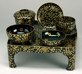 The Japanese novelist, Junichiro Tanizaki, wrote an essay about Japanese aesthetics in 1934 called "In Praise of Shadows." A passage from that essay depicts the gold and silver encrusted lacquer ware known as maki-e, as follows: "People commonly find those gaudy maki-e…uncomfortably jarring, even distasteful to look at. Yet envelop (them)…in pitch-blackness. Then substitute…a candle for the rays of the sun… and suddenly that brashness is plunged to the depths of a solemn, astringent subtlety." Indeed, in the 8th century—when maki-e was first developed in Japan—the deep shadows of Japanese interiors were relieved only by the light of oil lamps, the play of reflected light on gold brocades or polished lacquer, or a furtive glint from the polished edge of a moving sword.
Maki-e literally means, "sprinkled picture" and involves sprinkling gold, silver, and other metal flakes 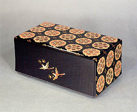 and powders, onto a deep-black lacquered surface. While it sounds simple enough, this exquisite art is the result of hundreds of complex and painstaking techniques for applying the minute flecks and powders of metal, married to the even older techniques of Japanese lacquer ware known as shikki.
Most lacquer ware is found in red or black. The preperation and application technique was developed in China as early as 9,000 years ago. Lacquer is made from the sap of the urushi tree (Rhu vemiciliua), a relative of the poison sumac. Lacquer workers must develop immunity to the material over time. The lacquer is very gummy when wet, very durable, acid, alkali, and waterproof when dry. The traditional style employs a painstaking technique that requires up to 20 thin layers to be built up slowly, and each layer thoroughly dried in a humid, dustless atmosphere, and then polished. Lacquer is used to coat everything from delicate hair combs to large and elaborate furnishings, as well as interior and some exterior surfaces.
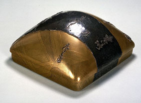 There are three basic styles for developing a maki-e design. Togidaishi uses metal powders and flakes that are applied to a wet lacquer surface and allowed to dry before another layer of black lacquer is applied over the total surface. This coat is polished with charcoal until the design underneath is revealed and level with the topcoat. Hiramakie uses the same gold, silver, and various metal alloys, applied directly to the surface, with a final coating of clear lacquer that leaves the applied areas slightly raised above the surrounding surface. Takamakie uses a raised design built of lacquer and clay to give a more sculptured form to the overlaid metallic designs.
Designs tend to be of two types: repetitive shapes and combinations of shapes to form an overall graphic design, and representative scenes of literary or landscape themes. Japanese calligraphy often plays a part in any type of design.
In an age before the advent of metal plating, maki-e techniques were often used to totally envelop a form, in such a way as to make it indistinguishable from a metal object. Objects ranging from makeup utensils to the scabbards of swords often employ gunmetal-gray alloys to produce striking and durable designs.

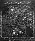 When the Portuguese landed in Japan in the mid 16th century, they became great fans of the art and began exporting it to Europe. They often ordered custom designed pieces and were particularly fond of maki-e with mother of pearl inlays, a technique known as raden. They were also fond of pieces where the entire surface was covered in designs. Made expressly for the export market and sporting European themes and applications (such as portable alters) these pieces are know as Nanban ("southern barbarian") ware.
As with many crafts developed in ancient times, the completely different esthetics and requirements of the modern day customer have brought changes to the craft in order to keep it commercially viable. One such change came with the application of maki-e techniques to fountain pens, by the founder of the Namiki Manufacturing Company (the present day Pilot Pen Company) around 1925. The pen case is sometimes made of wood but is more often made of ebonite. One such pen from around 1928, featuring an unusually large size and decorated with two dragons in clouds of gold, brought a price of USD284,000 at auction in 2000. This pen was one of those produced under a contract with Alfred Dunhill and known as a Dunhill-Namiki pen. Today maki-e pens have a sizable following outside Japan, helping to keep this ancient craft alive.
(Originally printed in "Fujinon Scope" )
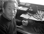 Ryushi Komada no longer sits barefoot at a low table on a tatami matted floor—the traditional style for Japanese artisans in crafts as diverse as basket weaving and gold
inlay on lacquer. At 72 years of age, 56 of those as a carver, Ryushi sits comfortably
at his workbench in a soft leather swivel chair. "My father learned carving from
my grandfather and I spent 12 years at my father's side learning how to carve
okimono,"(statuettes) he says,"When he died, I became independent and
changed to carving netsuke."
Netsuke is one small part of an accessory that was common in Japan long
before owning a Gucchi bag or wearing Levi jeans became as normal as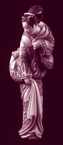 using
chopsticks. The traditional clothing worn by Japanese called a kimono
(somewhat like a robe) is tied with a sash around the waste. These garments
do not contain pockets so the custom of carrying items hung from the sash
was born. These items, collectively known as sagemono, included small wooden boxes called inro, tobacco pouches and pipes, writing instruments and others. The doubled cord that secures the sagemono to the sash passes through an ojime (bead) and is held to the sash with a netsuke, (a kind of a toggle like a large button or hook). This toggle, usually of hard wood or ivory, is intricately carved and lavished with much affection, humor and considerable carving skill. Probably begun in the late 16th century and spurred on by the practice of tobacco smoking that spread throughout the country by the 17th century, netsuke developed into a free form of expression unburdened by the stricter conventions placed on other artforms, such as Buddhist statue carving, in the Edo period (1615-1868). Ultimately, the change to Western style clothing and the practice of cigarette smoking combined to make the use of sagemono—and netsuke along with it—obsolete. Though such accessories are today sold more as objects of art than of practical use, the love for this traditional art form still burns brightly in Ryushi's eyes.
These days, for Ryushi, the joy of carving is almost secondary to the act of teaching. His classes are filled with students who have sought out and found that same joy. It spurs them to struggle to produce one to two pieces per month that sell for several hundred to several thousand dollars each. Of course, the ability to sell work and fetch a good price depends on finding buyers. Indeed, thanks to strong interest in Europe and America, a netsuke reached the price of 150,000 dollars for the first time at an auction at Sotheby's in 2005. But the situation is different in Japan. "For okimono, the otana (broker) system insured that a carver was supplied with good quality materials and all of his work was sold. In more recent times, the main outlet for netsuke had been through department store exhibitions. But this system restricts a carver's creativity because department stores accept only pieces they think their customers will buy. These days, young carvers are holding their own shows in galleries just like other artists."
The history of netsuke is usually divided into three periods; 17th to early 19th century, middle 19th century, and late 19th to the present. It can be generally said that netsuke from the early period was influenced by Chinese themes and wood was the prevalent material. The middle period was a "golden age" with fully realized Japanese themes and prevalent use of ivory. While the late period saw first a decline—due to the change to Western conventions—and then a resurgence as foreigners discovered in netsuke a strong collectable and resale value. It is this collectable aspect that has kept the ancient art alive and sustains it to this day.
Traditional netsuke are carved in several basic forms:
Sashi is an elongated form and may have been the original type. It is generally a hook-like shape and often found undecorated.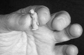
Ryusa netsuke are either flattish or three-dimensional but are distinct in being extensively pierced and hollow in the center.
Kagami buta are usually in two parts. Shaped like a manju, they often have a removable lid fashioned in metal.Katabori netsuke are the most sculpture-like, fully three-dimensional and the most varied in subject matter.
Men netsuke are masks. These are often based on the masks of traditional Japanese theater like Noh and Gagaku.
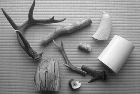 Whatever the form, netsuke are generally carved from one solid piece of material. All are small in scale (1 to 4 inches) and generally rounded or compact forms (except for the elongated sashi). They all have two holes in the back (except the sashi), a smaller one for the cord and a larger one for the knot of the cord. A wide variety of materials are used including ivory palm nuts, coral, stone, metal, amber, ceramic and crystal. However the most popular materials are wood and ivory, sometimes lacquered and inlaid with other materials. Tools are made of high-carbon steel and consist basically of saws, files, drills, carvers and scrapers. Scrapers are tools with the bevel cut on the opposite side, when compared to cutters, and are used perpendicular to the work surface. Scrapers are used primarily with ivory or other bone materials.
Ryushi agrees that the influence of foreigners has been great and, for the most part, positive and welcome. He laments the fact that his countrymen have not always realized the value of collecting netsuke and that much of the best work will end up in foreign collections. But he is determined to see new generations of carvers perpetuate the craft.
I asked him what was the most important thing he tries to teach his students. "Be creative and unique," he says, and goes on to tell me a little story. "When I was a young man, I worked for about one year with the famous netsuke carver Ichiro Inada. Inada sensei (teacher) insisted that I practice by copying one of his pieces. I did, and got the shock of my life. My copy was identical to my teacher's! Now, the world of netsuke is plagued by fakes and I realized then and there I had come to a fork in the road. I could continue to make perfect copies of famous works—which were in great demand by collectors—or create original work and perpetuate my own skill and the art as a whole. For me, there was only one choice then and only one choice to this day; create, create, create!"
The Cultivation of Bonsai
(Originally printed in "Fujinon Scope" )
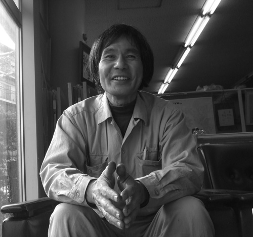 "Bonsai are just the same as trees growing in nature, (yet) bonsai are entirely different from trees growing in nature." This seemingly contradictory thought comes from Masakuni Kawasumi III, the man that I have come to speak to about the 2000 year old Chinese art of pensai, or, as the Japanese came to call it, bonsai. The exact origins of the art remain unclear, but it seems to have begun with the contemplation and arrangement in shallow pottery (pen) of small rocks resembling great mountains. The Taoists (and later the Chan Buddhists) of ancient China brought this together with certain ancient Indian herb-growing practices to form miniature landscapes and what we now call bonsai.
Fast-forward to March 2008. I am asking Kawasumi Sensei about his grandfather, Masakuni I (1880-1950), who began manufacturing scissors and precision cutting tools in the early 1900s. My questions turn toward Kyuzo Murata, the man who revived bonsai in the modern period. Kyuzo Murata is also credited with collaborating with the Masakuni family to create the first line of bonsai tools, for which the name Masakuni is world famous. Murata was part of a small group of families cultivating bonsai in the area around the city of Omiya, north of Tokyo. During the war, Murata continued to care for bonsai left behind in the bonsai-cho (bonsai village) at his property, Kyuka-en (the Garden of Nine Mists). After the war both he and Masakuni II (Kawasumi Sensei's father) did 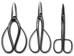 much to promote the art of bonsai both in and outside of Japan."Foreigners influenced by these men in the '70s and '80s are the top people in bonsai today," says Kawasumi Sensei. "About 50 percent of my bonsai tools are now sold abroad and the percentage is growing."
Kyuzo Murata passed away in the process of writing a book, "Bonsai, Nature in Miniature," which was finished and published by his son, Isamu Murata. Likewise, Masakuni II was working on a book when he suddenly passed away in the summer of 2002. Masakuni III completed this excellent work and published it under the title "The Secret Techniques of Bonsai" in 2005.
As a toolmaker, Kawasumi Sensei has made tools even for the Emperor of Japan. But it was his family's unique relationship with the world of bonsai that inspired him to become the first certified arborist in Japan to specialize in bonsai. Though he laments not having the time to properly look after the many bonsai left in his care by his late father, I get the impression that he is an incredible bundle of energy, talking nonstop, and running—not walking—everywhere he goes. In between taking me on a tour of the tool museum on the second floor of his factory and instructing me on his favorite composer, Takemitsu Toru, he manages to explain something about bonsai. Bonsai can be created in one of several ways.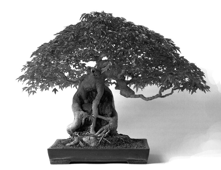
Growing from seed (misho): Seeds from plants such as black pine, trident maple, and Japanese maple, along with many others, are used. When the seeds start to sprout, they must be replanted in a very shallow tray after having their taproots carefully cut.
Growing from cuttings (sashiki): Many types of bonsai can be grown from cuttings of full-sized trees. The end of the cut stem should be re-cut with a very sharp blade and immediately immersed in water, where it is kept overnight before planting.
Layering (toriki): This involves stripping off a section of bark and cambium from an established tree, packing the area with sphagnum moss until new roots grow out of the scraped area, then cutting just below this new growth and re-establishing in a pot.
Grafting (tsugiki): This technique uses cuttings grafted onto older and more established tree stocks, the purpose being to promote growth of the new tree more quickly.
The Quiet Beauty of the Japanese Garden
(Originally printed in "Fujinon Scope" )
 The Japanese have been creating gardens continually for more than fifteen hundred years. This is all the more astonishing when you consider that the same philosophy and many of the same techniques developed in ancient times are still employed today.
"Japanese have great respect for nature which comes from our Shinto belief." I've come to the town of Tsurukawa on the outskirts of Western Tokyo, to speak with master gardener Sadao Yasumoro. Yasumoro sensei has been building gardens for more than 40 years, and is one of the premier niwashi (gardeners) of Japan. He is also full of mischief and energy belying his 67 years.
He drives me around in his little pickup truck, and stops at a house to show me some of his work. Instead of ringing the doorbell, he scoots over a fence at the side of the house and beckons me to follow him. When I protest he says to me "daijyobu (don't worry) no appo (no appointment),"meaning he has carte blanch to enter at anytime. I timidly follow and when an astonished housewife appears at her window, he cheerfully explains that he has brought a friend "just out of the bath" (nyuyoku in Japanese—which sounds like New York, my home town), and laughs at his own joke. But his work does not so much inspire laughter as it elicits smiles and thoughts of paradise.
"When I was young,"he tells me, "I traveled for two years all over Japan and studied every important garden in the country."Study of this nature is critical to Japanese gardeners, most of who learn their craft in the apprenticeship tradition. Indeed, the oldest text on garden making, the 12th century Sakuteiki, exhorts garden makers to "…let the works of past masters be your guide."This text is still the bible of Japanese gardening, and its principles are kept alive by every garden designer.
A number of characteristics distinguish Japanese gardens from those found anywhere else in the world. There are the obvious things like stone lanterns (ishi doro), but perhaps the two most distinguishing characteristics of the Japanese garden are an emphasis on broadleaf evergreens and the prominent use of rough stone settings and pathways that define the structure of the garden.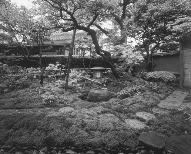
Yasumoro sensei is showing me some recent stonework, in the form of a tsukubai, a low-slung stone water basin arrangement that is a required feature of tea gardens (chaniwa). "It was stuck around the side of the building. We dragged it out and reset it in its new position to bring out its beauty." These days, cranes are employed to lift heavy stones and large trees but there are still many places where time-honored techniques and brute force are the order of the day. Yasumoro sensei has a crook in his neck. "Its from carrying stone" he says, and explains how a stone is hung from a thick pole and lifted on the shoulders to haul it into position. A thousand years ago, gardens were often built by lower ranking Buddhist priests called ishi tate so (stone-standing priest). So important is stone setting to the Japanese garden that the term "standing stones" was a euphemism for garden making. Around the 14th century, a style of garden known as karesansui (dry garden), developed under the influence of Zen Buddhism. These gardens contain only stone and sand and, as such, have come to be associated with minimalism and modernism by many of their contemporary admirers. But this is not the only type of garden influenced by Zen.
The practice of drinking tea was originally an aid to fight drowsiness during long hours of meditation. The upper class, and then the merchant class adopted the practice toward the end of the 15th century. The practice grew into a social ritual centered on the concept of purifying the spirit and honoring simplicity and sincerity. This ritual, known as the tea ceremony, is widely practiced throughout the country to this day. The setting for this ceremony is the teahouse placed within a tea garden made in the image of a mountain retreat. The structure of both the teahouse and the tea garden is aimed at preparing the visitor for a transformation from the profane to the spiritual world.
Yasumoro sensei doesn't like to put much emphasis on the influence of Buddhism. Like any good craftsman, he knows that art is one percent inspiration and ninety nine percent perspiration. Its not that he lacks a sense of the spiritual, it's more that he has a healthy irreverence for doctrine of any stripe. "For me, creating a garden is not about previously decided methods and materials, nor is it about religion or philosophy. For me it is just about using your own energy and skill to create a natural environment to be enjoyed."
It is this sense of naturalism that is most striking in Japanese gardens. Asymmetry, extensive use of ground covers like ferns and moss, and rough stone settings, all add to the rustic look that characterizes these gardens. The lack of decorative flowers like roses and tulips is another. Of course, the garden is not totally devoid of color. The Japanese are acutely aware of the four seasons and plants are used to reflect the change of season. Among these are the azalea (satsuki), flowering apricot (ume), and the flowering cherry (sakura) in shades from white to salmon pink to red. The brief blossoming of cherry trees is celebrated throughout the country with outdoor drinking parties on a massive scale. And the ancient temples of Kyoto are best seen framed by the brilliant fall reds, oranges, and yellows of the Japanese maples that fill the mountainsides around them.
Yasumoro sensei takes me to a garden under construction, as his crew is finishing up work on a wall made of clay called a dobei. The method of making a wood and bamboo frame, mixing clay and rice straw, and constructing a roof of ceramic tile (kawara), has been handed down from master to apprentice throughout the centuries. Our conversation about traditions turns me back to philosophy but he only wants to make jokes. Finally I get him to be serious just long enough to tell me about his own approach to gardenmaking.
"While listening to the gods (kami) living in the site, and bearing in mind the feelings of the owner, I begin the work. In the case of a tea garden for example, differences in the owners approach to tea need to be respected, and this influences how the garden will be constructed. But even then, one should never be so serious as to get in the way of deep emotion. The most important thing of all is to put your whole heart into your work."
Art, Design, Craft and Creativity
(From a lecture delivered to the Japanese Garden Association)
I was having a conversation with a number of landscape architects and garden designers when the subject of someone's work came up and someone else called it art. I denied that the work in question was art and gave my reasons. Katsuo Motohashi, a garden designer from Chiba who was in charge of the Japanese Garden Associations International Seminar on the Japanese Garden to be held in Tokyo the following year, was intrigued by my comments. Subsequently he asked me to be one of the speakers at the preliminary event held in Waseda University. This paper is a modified version of the speech, which I gave on that occasion.
THEME
What is the difference between art, design and craft; why is one of no higher value than the other, and how does creativity play a role in each?
SUB-THEME
How does this theme apply to the Japanese Garden?
Major premise:
Art can be either good or bad. Design can be either good or bad. Craft can be either good or bad. Being good or even "great" is not a criterion for whether something belongs to a certain category such as art or design. The real criteria is intention and, to some degree, method. Good, bad, well made, skillful, expensive, famous are all value judgments unrelated to whether something is art, design, or craft.
Basic premise and definitions
A standard misinterpretation of art is the formula art = "the best". This is a common mistake that leads people to compliment any sort of thing that they feel is in some way exceptional, by labeling it "art". Someone will compliment the chief by saying, "That's not food, that's art!" or someone else will compliment their favorite hairdresser by saying, "He is an artist." Meaning no disrespect to the chief, his work is not art; it is food. And while the hairdresser is no doubt a genius with scissors and brush, he is not an artist. It is more likely that he is an excellent craftsman and designer.
In other words, art does not equal "the best." Art is not better or more important or of higher quality than design or craft. Art does not imply a value higher than the value of design or craft. Art is a neutral term describing the result of an impulse to create, without any purpose or limitations to that creation other than the artist's own desire to carry it out. It is a selfish, self-serving, and largely self-referential activity that requires no special technical knowledge. When it has a value to anyone other than the artist, that value is related to intangible benefits. It may forecast trends in the society in general or in a limited area. It may speak to others on an emotional or psychological level that helps others to understand their own minds and hearts. It may reveal some universal truth or it may speak of one particular truth. It may inspire others to find their voice and attempt to speak through some secondary media or other. It may simply amplify, educate, or entertain. It often has more benefit to the creator than the observer and is often recognized only by the creator and a small circle of observers as having any value at all. It will usually contain some degree of design and craft.
Art cannot be created on demand or for a specific price or to fit a specific time frame or function except in the most general of ways. A painter may be asked to create a painting for a certain location for a certain price and within a certain timeframe. Such a work comes close to the definition of design and craft. The degree to which it is art will depend on the strictness of the boundaries under which the work will be accepted as having fulfilled the expectations of the buyer. For example, is it similar to other works by the artist or completely unexpected? Is it in a medium that the artist felt compelled to use, but which has a very short lifespan or no intrinsic value? Is it taking "too long" or costing "too much money" and is it therefore curtailed? Does the artist have the right to just give up part way through? To the degree the constraints and commitments confine the work, is the degree to which the work enters the realm of design and craft. (All of this holds true for sculpture, filmmaking, or any other media used.)
In summary, art has no purpose, no direction, no clear criteria for success, and no limitations other than those of the individual or group that creates it. It may or may not include a high level of craft or design. The result of the artistic impulse may be good or bad and the outcome may or may not have value. That value is extremely relative and transient. The degree to which it is considered to have value is not related to whether it is or is not art. Value is related to whether it is considered good art or bad art by the degree of acceptance it receives in its own time or in the future. The value of the materials may be determined and affect the value as an object (i.e. a work in gold or some other precious material that has its own market value) but that is aside from its value as art.
By contrast, design has a purpose, it has direction, it has conditions usually set by someone other than the designer, and it has more or less clear criteria for success and the determination of value. Design often requires a specialized knowledge and much of that knowledge is geared toward the production of the design and of its use (for example an architect is a designer who has knowledge of how a building is built and for what purpose it will be used). The production of the design is most often not in the hands of the designer who may or may not direct or participate in the production. Design is by definition the creation of form and content directed toward a specific purpose, such as moving a person from point A to point B. The conditions of that movement (weight of the person, distance, cost, speed, etc.) will strongly determine the outcome of that design—a car, bicycle, airplane or ambulance. Cost considerations, available technology, aesthetics, and patents or copyrights held by others will all be factors in determining the direction and outcome of the design. Many if not most of these factors will be outside the control of the designer. The ultimate success and value of the design will be determined by how well it sells, how well it fulfills the purpose intended for the final product (it may be a beautiful knife but does it cut well? it may be an aesthetically pleasing design but is it easy to use? It may be a beautiful advertisement, but does it bring customers into the stores?). How durable it is, how much potential it has for creating new business, etc., as much as how it looks or feels, are essential qualities of design. It is incorrect to say that a design was good but it didn't work or its cost was too high. These are intrinsic conditions of design and if they are not satisfied, the design cannot be said to be good. This notion comes from the mistaken concept that design is mostly about good looks. This is the same misconception that prompts the equation: good design = art. If design is art (at least by the definitions above), it is not good design. But good design is no less than art. It is simply a different animal.
In summary, design has a purpose, a direction, rather clear criteria for success, and clear limitations, conditions, restrictions, etc. To the degree that it fulfills or even exceeds all the criteria laid out for it, it is a good or even great design. Its value is usually predetermined as one of the criteria it must meet. That value may also be affected by external conditions unrelated to the design (i.e. a sudden economic downturn or completely new technology), but that will not be a factor in determining if the design was good or not. Nor is its ability to endure over time. Obsolescence may be built into the design and therefore becoming obsolete will be a mark of its success. The amount of participation played by aesthetics will vary from little or none to predominant. It may depend solely on the skill and ability of the designer or it (more likely) will involve the skills and abilities of a small to large number of people. It must have intrinsic value on a scale proportionate to its manufacturing costs and sale price.
Finally, craft is similar to design in its purpose, direction and criteria for success. However craft is more equivalent to production, though it is understood that the skill of the craftsman goes a long way in determining the outcome of the product (as opposed to the automated production process which will typically involve craftsman in the creation of the process and its components, rather than in the final product). Craft will employ design but design prerogatives may or may not be within the purview of the craftsman. Generally both design and craft involve some degree of the other. A good craftsman can greatly improve a design with his knowledge of materials and production methods as a designer may produce better craft by introducing new ideas, new aesthetics or new performance criteria. The emphasis of craft is on functionality, durability, consistency of product, and (generally) reproducibility at the same level of quality over a period of time. Good or bad craft will generally relate to the physical (as opposed to the aesthetic or emotive) attributes. Craft operates under basically the same constrictions of time, cost, etc. as design. The aesthetics are largely determined by the design (which may or may not be in the hands of the craftsman) but the level of craft will impact on the aesthetics in a positive or negative manner. The value of craft as good or great is determined when it fulfills or exceeds its requirements, often in service of the design.
In summary, craft has a purpose, a direction, rather clear criteria for success, and clear limitations, conditions, restrictions, etc. To the degree that it fulfills or even exceeds all the criteria laid out for it, it is a good or even great craft. Its value is usually predetermined as one of the criteria it must meet. That value may be affected by external conditions unrelated to the craft (i.e. a sudden changes in material cost or completely new technology), but that will not be a factor in determining if the craft was good or not. Nor is its ability to endure over time. Limited or short-term use may be one of the parameters. The amount of participation played by aesthetics will vary from little or none to predominant. It may depend solely on the skill and ability of the craftsman or it may involve the skills and abilities of a small to large number of people. The craft must have intrinsic value on a scale proportionate to its manufacturing costs and sale price.
Another way to look at similarities and differences is based on the content of the method or process involved in each.
ART: Relies heavily on self-determination, individual pursuit of "meaning" as manifest in the work, experimentation, and "mindless" activity. Conceptualization and production are usually an organic whole. Art is self-taught or taught by example but there is no clear formula for making "good" or "successful" art.
DESIGN: Relies heavily upon both self- and group- determination, pursuit of solutions to posited problems, experimentation, some "mindless" but mostly "mindful" activity, ability to satisfy numerous conditions toward some useful (usually utilitarian) or applied outcome. Conceptualization and production phases are usually separate (though some trial and error interplay may occur) and production usually relies heavily on coordination with and the skill of others and of technology. Design can be studied and taught with a more or less clear formula for successful if not great design. Depending on the product being designed, a high level of technical knowledge may be needed.
CRAFT: Relies heavily on precedent in terms of material and technical capabilities and systems. Attention to physical rather than conceptual aspects is paramount. Indeed, conceptual work may be partially or entirely carried out by others. The work of a single individual or organized group with a rigidly set process is usually involved. One particular group of craftsman are usually limited to a specific group of materials and processes that are well understood and manipulated to a high degree of finish, based on a well-understood set of rules. Craft is studied and learned over a long period of time and must be taught by those with experience in the process, to newcomers in the field. The aim is to assure a consistent and successful outcome over time.
Yet another way to view these definitions based on possible criteria of "good" or "bad" for each, is by responding to the question, "How is Art (Design, Craft) determined to be Good?"
"How is Art Determined to be Good?"
1. By the determination of experts in the field
2. By a high commercial value, especially over time
3. By changes in philosophy or in the society, which brings it recognition over time (and therefore deem to have been ahead of its time or prophetic)
4. By the endurance of acclimation over time
5. By popular demand (to view or own it)
6. By the acclaim of peers
7. By the volume of product over time (the durability of the artist)
"How is Design Determined to be Good?"
1. By popular demand (to view or own it)
2. By a high commercial value, especially immediately
3. By the determination of experts in the field
4. By the amount of and distance of dissemination
5. By product strength, durability, and other physical characteristics
6. By the endurance of acclimation over time
7. By the acclaim of users
8. By the speed with which it adapts to changing needs
"How is Craft Determined to be Good?"
1. By popular demand (to view or own it)
2. By a high commercial value, both immediately and over time.
3. By product durability
4. By the endurance of acclimation over time.
5. By product strength, durability, and other physical characteristics
6. By the determination of experts in the field.
7. By the acclaim of users
In general, definitions of Art, Design and Craft are relatively new phenomena, stemming largely from the influence of technology and mechanically based production systems including printing, photography, film and computers. One source of confusion about the difference between art, design and craft is in their changing roles in the society over time. In other words, the artist was once the only means of visual reproduction. He was therefore artist, designer, and craftsman rolled into one. Gradually, due to the volume of goods needed and the scale of the product (i.e. castles, bridges, boats, books, etc.), craftsman became increasingly specialized and distanced from art and design (though both of these still employed and emphasized a high degree of craftsmanship on the part of individual artist/designers).
Painting, drawing, and sculpture for example, once played a very important role in representation and were essential to the dissemination of knowledge. As these roles were taken over by printing, photography, film, TV, X-ray, etc., more traditional arts and crafts veered toward self-expression, abstraction, self-reference and experimentation, although they still play some role in representation. Technology largely relegated art to the position of "non-essential item." Does this mean that art is more or less "art" than it once was? No. It means that the advent of technology removed most of the functional aspects—or to put it another way, the design and craft aspects—from art and freed it (or pushed it) to be more experimental, theoretical, mystical and heretical (and also allowed it to be sloppier, less durable, and more transient).
Take, for example, Leonardo. Was he an artist? Unquestionably. Does that mean that everything he did was art? Certainly not! He was also a designer, an architect, an engineer, a scientist, a genius, and an individual of great creative power and highly developed skills. This last point is key to why the work of the ancients is more often considered art—no matter who made it or what it is—as compared to contemporary art. It is simply because the ancients exhibited a high level of craft and, in our age of machine-made objects, a high degree of hand-skill is highly valued and easily mistaken for art. But for the people of the age in which this work was created, it was not a question of art, but one of function, beauty, and virtue. The work had a recognized purpose, without which it would be nothing but folly. However, once printing and then photo reproduction came on the scene the great divide between the necessities of quick and inexpensive and the "nice to have's" of hand-made but slow and costly, began in earnest. In other words, the difference between those products with an easily fixed (though fluctuating) value vs. those products that are difficult to value came to be defined by what was readily available and what was not. Technology put things conveniently within reach of everyone. Though each "unit" thus became cheap, the total value to the society became great. Whereas those things which were or are not yet subject to technology are expensive by unit cost, but far less valuable to the society as a whole. (For example, a printed paperback is reproduced by the hundreds of thousands and though each book is cheap the value to the society is much greater than a handmade, illuminated book which is a valuable object that offers little value to the society in general.)
Another source of confusion is the review of historical works through the filter of modern sensibilities. This often causes the label "art" to be attached to objects simply because they have survived from ancient civilizations. Museums are full of such objects, most of which demonstrate varying degrees and combinations of art, design, and craft. Many are of little value other than that they are old.
The Role of Creativity
Creativity is the ability to reach within and externalize the internal. It involves combining emotions, memories, knowledge, experience and other human capacities, in the service of a physical entity. That entity may be an object, a movement (a dance), sounds (music), or any type of physical manifestation. Creativity is the opposite of reproduction in that it is original production. Though the result of the creative act will likely retain some aspects of the physical world that is already manifest and in which its creator exists, it is likely to result in something "new".
Creativity is usually essential to both good art and good design and usually implies a degree of uniqueness, originality and invention. Creativity is however less important to craft (except in creating new methods of production) than is the perfection of method. Such perfection usually happens through the repetition of a certain set of skills and materials.
Relationship of this theme to the Japanese Garden
Returning to the original focus of this piece, which began as a talk to the Japanese Garden Society, the relationship is in the question "Is the Japanese Garden Art?"
Seen in the light of my basic premises on art, design, and craft, as outlined above, the simple answer is "generally, no". To state it more completely, where the garden has been made to a predetermined area, at a predetermined cost and time schedule, with demands for durability etc. and with other demands and needs of the customer in mind—as is the case with almost every garden—it is not art. In that case it is design. On the other hand, if it has been made with no purpose, no restriction of area, budget, client desire, etc., and solely for the purpose of exploring the possibility of expression through the use of materials which may or may not normally be associated with Japanese gardens, is can be art. Again, this does not answer the question of whether a particular garden is good or bad, but only if it is art.
It also does not imply that—as design—it is of lesser value, lesser skill or lesser importance than art. Considering this definition, it is clear that the vast majority of Japanese gardens are not art but design. Furthermore, the realization of the design, as with creations such as music and architecture, is highly dependent on craft. In other words, while both good art and good design almost always rely on creativity, the manifestation of good design relies more heavily on good craft than does good art—which may be totally or almost totally devoid of craft.
The visual techniques employed in the design of Japanese gardens have a great deal in common with other forms of two and three-dimensional representational techniques. The similarities between the painters use of composition, foreshortening, light and shade, etc., and the design of gardens intended for viewing from a position inside an adjacent room, are particularly striking. The Japanese garden is generally a combination of design principles and craftsmanship, using primarily living and non-living natural materials, applied to a specific site with a specific effect in mind. That effect may be to invoke a popular scene from some part of the country or a literary passage in a famous story. It may be intended to recall a natural forest or lakeside setting. But whatever the design or effect, the Japanese Garden generally lies squarely in the area between design and craft. As design, it seeks to find a solution to a posited problem. This problem is usually something like, "How can a certain piece of land be developed, under certain circumstances and with certain conditions, to create what is considered by the owner of the property, the creator, other observers, and historical presidents to be a meaningful and or pleasing environment?"
As craft, it relies heavily on a certain set of materials, manipulated according to certain rules and historical precedents, environmental conditions, etc., by people trained in a particular set of skills, under the supervision of the designer or his proxy. The execution of the design relies heavily on the hand of the craftsman who may or may not be the designer. The results must be reasonably durable, functional and conform to some standard of beauty and quality. The success of the design is virtually indistinguishable from the quality of the craft.
Can the Japanese Garden ever be considered art?
This is a difficult and open question. Historically, I believe that the early karesansui (sand and stone) gardens come closest to the definition of art proposed in this paper. I am not referring here to the original "dry landscape" as described in the twelfth century garden treatise known as "Sakuteiki" but to those gardens associated with Zen. Certainly, it appears that the lack of "pleasing effect" displayed by such gardens, as well as the lack of basic garden materials such as plants and water, displays a disregard for the typical conventions of garden design. It would appear that Buddhist monks created most of these early gardens in areas adjacent to quarters not open to the public. Such gardens display a leap of thinking more indicative of art than design or craft. In seems that such gardens were created as an aid to meditation. They seem to have been inspired by Chinese-style ink painting of mountainous and cloud-filled landscapes, many of which display an ethereal, almost abstract image, also indicative of karesansui gardens. These suibokuga ink-wash paintings and techniques were transmitted primarily by Chan monks from China through the Zen temples and created in Japan to similar effect. The connection between the characteristics of suibokuga and karesansui seems obvious even to the casual observer but it may be that one was not a direct influence of the other. Rather it was likely the result of the pervading atmosphere surrounding both, of a search for spiritual enlightenment and the austerity that accompanied that search. To the degree that such gardens lacked any conditions or limitations on their making (other than a wall-enclosed area of some fixed size) and to the degree that their only utilitarian aspect was to elicit an emotional or spiritual response—I believe they can be considered art. (However whether they can be considered gardens or sculptural installations is a problem for another paper.) Although much has been made of the craft of gardens such as Ryoan-ji—such as in the placement of its limited number of stones—I suspect that this was always secondary to the intentions of the creators. In other words, unlike most Japanese gardens, these karesansui rely far less on craft than on a freeform play between the creator and a limited number of materials, with an eye toward an abstract expression. Their affinity to art is therefore far greater than other garden forms. Again, this is not a value judgment as to rather they are good or bad.
A more contemporary example, which I do not consider to be art, is the work of Mirei Shigemori (1896-1975). Though I do not consider his work art, I mention this work for several reasons.
Firstly, it is often mistaken for art because of its occasionally radical departure from more traditional Japanese garden design. Shigemori was a writer, researcher and designer who had a profound understanding of traditional garden design. He single handily tried to drag traditional garden design into the modern world. To do this, he employed radically stylized, curvilinear designs, with copious use of cement and stucco. There is no doubt that his work is as much design and craft as any traditional garden. Though he used his garden design to make a design statement unlike anything that had been seen before, and his use of some untypical garden materials is provocative, it was still very much set within the garden milieu.
Secondly, his work shows the difficulty in actually taking the garden out of its position in design and craft (where it has a traditionally defined and accepted role as "pleasing environment"), and turning it into an expression of an individual vision. Because of his radical view of the garden he is equally praised and reviled. I have been told my any number of garden designer/builders that Shigemori's work has nothing to do with Japanese gardens and they consider his work quite ugly. Certainly, not all of his designs have been successful and many of his gardens have been neglected and are in poor repair. Those gardens seem to point out the failure of a material such as colored concrete to either regenerate itself or develop a pleasing patina as it ages. But I suspect the real problem that many garden designers have with the work is the uncomfortable challenge it poses to those working in a traditional craft. The challenge is how to stay relevant in the contemporary world and whether one need try or not.
Illustration Page

| top row 1 | 2 | 3 | 4 | 5 | 6 | 7 | 8 | 9 | 10 |
| middle row 11 | 12 | 13 | 14 | 15 | 16 | 17 | 18 | 19 | 20 |
| bottom row 21 | 22 | 23 | 24 | 25 | 26 | 27 | 28 | 29 | 30 |
1. Detail of a design for a wall painting for the A Life Cafe in the Roppongi district of Tokyo. The full painting occupied an area of about 4 by 5 meters. I also carried out the full-size work.
2. A computer graphic for a financial management company in Tokyo. The illustration was part of an ad, also designed by me, for a financial product called "Rubicon".
3. A small watercolor.
4. A scarf design commemorating the 150th anniversary of Japanese-American relations. Left and right sides show a potential repeat for a larger fabric design.
5. Adam, Eve, Snake, Dog. A recurring theme in my work is Adam and Eve and the tribulations they suffer. These often manifest as a conflict with snakes and wild dogs. The Adam and Eve were executed as a set, painted on black, ostrich-textured vinyl, 2 meters tall by 1.2 metes wide. Painted in white, red and black. The Dog and Snake is a separate painting combined for display on this page. It was painted in the same colors and around the same time on black alligator-textured vinyl about the same size as the Adam and Eve.
6. Another Adam and Eve titled "Paradise of Pain". This one is a small watercolor.
7. Another recurring theme is figures with multiple arms and no head. Most of these works are small watercolors and some, as these two titled "Balance Man" and "Agony Man", have also been made into inexpensive lithographs. These are individual works combined for display on this page.
8. God, Adam and Eve. As Adam lies sleeping, God pulls Eve from his rib. But is it a generous gift or the original conflict between men over a woman?
9. "Everyman" in the form of a multi-armed figure hanging from a cross. As these figures began to emerge one after the other, they seemed to want recall biblical images. And so I let them.
10. Three separate images combined for display on this page. Left to right: "Vishnu Man", "Faithful Man", "Kali yuga Man". Both mythology and male/female relations crop up fairly consistently. But this is not intentional on my part. What is "intentional" is an arbitrary geography that I impose on the surface, and then on what ever appears there. I then bend the spontaneously occurring forms to this underlying geometry.
11. Two works in oil. Left: "Sanji no Anata" Right "Island of the Kewpies" These works are from a series which evolved by focusing on the formal element of an egg-shaped head on a long neck, a la Modigliani.
12. Illustration for a Japanese English language magazine called PHP Intersect. The story was about the author's perception of a naive Japanese foreign policy. The painting is in oil, executed in black and white.
13. A computer illustration of a weaver of Lombok Island in Indonesia.
14. This is an untitled painting in oil, which came to resemble the biblical story of the "Visitation", especially DaVinci's version. The full painting is to the right with a detail to the left.
15. This is an untitled painting of a fat woman, seemingly underwater, wearing a necklace of fish.
16. One of three illustrations in oil for a short story "The Summer After the War" by Kazuo Ishiguro appearing in Japanese Esquire magazine.
17. Two characters created for a shopping street, Chuo-dori, in the Shinjuku section of Tokyo.
18. A group of illustrations that are part of a large series called "Animarks".
19. Christmas and New Years rolled into one in this computer illustration for the cover of a Japanese English language magazine.
20. Left: A computer illustration for t-shirts for the Okinawa Marathon. Right: A koala in watercolor.
21to30. The entire bottom row is a group of work from a series of four calendars I created for a Japanese printing company. The theme was "Endangered Species" and the sponsor was the Nichiren Buddhist sect. All works are in oil. From left to right: Burrowing Owl. Resplendent Quetzal, Giant Panda, Tufted Puffin, Rock Hopper, baby Francois' leaf monkey, Stellers Eider, Short tail Albatross, Mandrill, Spotted Owl, Eurasian Eagleowl, Red shank Langor.
Design Page

| top row 1 | 2 | 3 | 4 | 5 | 6 | 7 | 8 | 9 | 10 |
| middle row 11 | 12 | 13 | 14 | 15 | 16 | 17 | 18 | 19 | 20 |
| bottom row 21 | 22 | 23 | 24 | 25 | 26 | 27 | 28 | 29 | 30 |
1. Detail of a display table for a clothing shop in Tokyo. I designed the table that measures approximately 60 cm by 3 meters. The legs are composed of several layers of wood and acrylic plastic and the base and frame of the tabletop is in wood. The table was constructed by a display company. The surface uses over 300 pieces of plastic floor tile, which I cut and pieced together. This is a unique technique that I developed and which, to my knowledge, has never been done by anyone else. The final surface is uniform and apparently seamless.
2. A booth design for a MacWorld show at the Makuhari Messe exhibition space in Chiba. The client, Koyosha Printing Co. was simultaneously highlighting the DTP skills and acting as distributor for a new 3D design software.
3. A Japanese kaiseki restaurant named "Ren" in the Shibuya district of Tokyo. I was responsible for the design as well as for painting the mural on the far wall.
4. A small, renovated office/gallery named Kobo in the Shimbashi district of Tokyo. This is an extremely small space of about 2.7 by 2.7 meters. The primary materials were wood and colored stainless steel. The small "L" shaped desk is hinged to the wall, allowing it to be raised to the left and right. The center pedestal is then removed to open up the entire floor space (such as it is). When closed, it accommodates seating for five on the outside and one on the inside of the "L". The exterior (left photo) of the building was only painted and the original window frame and door were stained.
5. Image drawings for a window detail and details of the planting scheme for the outdoor cafe of the restaurant "Las Chicas"in the Aoyama district of Tokyo.
6. Interior design for the "American Seafood Restaurant Rosebay House" in the "Sea Paradise" aquarium/amusement space in Kanagawa, about thirty minutes south of Yokohama. This is a large space seating about 170, with a self-service seafood bar 6 meters in length. I also designed all of the furniture, as well as the fish mural.
7. First floor, exterior view of restaurant "Las Chicas" in the Aoyama district of Tokyo. The area to the right has extendable tents on both sides and the accordion doors and window open fully to create an interior that is acts like a traditional Japanese engawa. Inside the main entrance, set back to the left, is another small seating area and a large bar. Behind the bar is a raised and semi-enclosed dining area with a slightly more formal atmosphere. The basement is a bar and club which opens at night. It also contains a separate rental space, which can be used for parties or exhibitions.
8. Interior view of the same restaurant showing the bar, a glimpse of the dining area behind, the custom designed lighting, and the metalwork surrounding the stairs that lead to the basement level club.
9. "Le Vin Bleu", a hostess club in the Ginza district of Tokyo. The view is towards the entrance from the interior. The doors are of color glass with a pattern cut into the glass, reminiscent of Japanese kiriko cut glass.
10. "Sanpo Chan" desk and chair with a table made of wax and a chair made of bent metal, cut and painted in the image of an imagined ancient Egyptian "Salary Man". All were created for the showroom opening of an interior design/build company called "Manufactury" in the Harajuku district of Tokyo.
11. "Lighthouse Table" is a three-legged table constructed of wood and entirely surfaced in two shades of terrazzo-look plastic floor tile. I created the design and did the surfacing work (a mammoth undertaking). Each leg contains lighting under a smoked-glass cover.
12. Image of the "Olive Cafe" interior in Osaka, showing the interior and exterior deck. Unfortunately I have no photos of the completed work.
13. "A Time Piece", installation in the Takashimaya department store shopping center in Futakatamagawaen in western Tokyo. This was part of a yearlong installation by different artists throughout the complex. My piece required some seating so I designed a group of sturdy wooden seats that took as there back rest a scaled down door, complete with doorknobs front and back. On the back of each chair, words were printed giving the impression of a room door. Cryptic words such as "Time", "My Death" etc., implied a portal to a time or a place. I created a park-like atmosphere by using inverted and charred Japanese umbrellas mounted at the tops of rough poles, suggestive of autumn colors and that time of year when, for me, the passing of time is most apparent.
14. Two pages from a sixteen-page manga, which I wrote and illustrated for the opening of a pool hall and lounge, "Dokyu Club", located in the waterfront area of Kobe. The piece on the left was also one of five wall paintings I created on the interior of the two-story warehouse renovation.
15. A number of graphic marks for new municipalities formed by combining several cities or counties. This work is from a number of competitions held to choose a simple graphic that symbolized the merits of the new municipal entity.
16. Detail of a computer illustration and logo for the CD of the musician "RA". I created the CD jacket design which folds out into a narrow, "horizontal poster".
17. CI design for a display design and build company "Shining Planet". I created this identity and the initial presentation materials of the company, which included a file folder and a custom vinyl envelope.
18. A twopage advertisement for the computer-chip division of Kawasaki Steel. The ad ran in several national computer magazines such as "The LAN Times" and the "Nikkei Communications".
19. Two four-page pamphlets for a college entrance exam cram school called "Pre-Pass". The upper pamphlet is targeted at students aiming to enter prestigious universities offering medical courses. The other is more generally targeted.
20. Some very large banner designs for client Panasonic, used at a large electronics show in Singapore. The banners feature a popular (at the time) pop-star from Taiwan.
21. Two pages from an eight-page brochure for client Fujinon. This subsidiary of Fujifilm is a maker of all types of camera lenses, including having the largest market share for cellphone camera lenses, and is also a maker of Endoscopes.
22. Book design of "The Japanese Dream House" for Kodansha International. I wrote the original proposal for the book, which is an overview of the typical (not the designer or the traditional style house) which Japanese people live in today. It also includes an overview of the history of Japanese housing. I invited author Azby Brown to write it. I also participated in the editing and wrote the captions for the photos, in addition to creating the design of this record-jacket sized, hardcover book.
23. Graphics for client Panasonic for the CeBIT electronics show in Hamburg Germany. Included large wall and backlit graphics, displaying the company's line of cellphones targeted at Europe.
24. Two-page advertisement for client IN4S (pronounced "in four s"). The product was a computer board meant to take the place of a router, hub and several other pieces of networking equipment. Also created folders and a brochure for the product launch.
25. Two pages from a sixty page annual report for the United Nations University's Institute of Advanced Studies in Tokyo. Separate annual reports, using the same design, were issued in English and Japanese.
26. Display designs for Citizen's PROMASTER line of watches.
27&28. Shoe designs for a competition sponsored by the shoe manufacturer's association of Kobe, Japan.
29. Working mock-up of a design for a piece of hospital lab equipment named "Beth Prep 3000" for client SATACO. This equipment automatically extracts a patents urine sample and passes it through a filter for testing, then self-cleans in preparation for another sample.
30. A rental phone for hospital patients, using a prepaid card sold by the hospital. This is a rendering of the design, which was required to incorporate an existing receiver available in one color and one shape only.
